
Unraveling the Mystery of Fluctuating Sales Outcomes

You’re stressed and anxious. Your numbers are NOT looking good for the month. You know that the upcoming sales meeting is going to be rough. It’s a terrible feeling, especially as you don’t believe you’ve done anything differently than last month.
Last month… when your team was rewarded with a pizza party to celebrate the great sales numbers. The company president even called to congratulate you on the great results.
Same inputs. Different outputs. Did you do something wrong? Your management is sure acting like it.
But the answer is simple – variation.
Every system has inputs, processes, and outputs. Every system also has variation.
Anybody working in quality control is well aware of this. Their job is to closely monitor the output of systems to identify variations that cause quality control issues.
The job of a quality control manager is to try and reduce the variation down to a reasonable level. In the case of manufacturing chicken tenders, some variation in size and shape is okay. In the case of pharmaceutical manufacturing, almost no variation is allowed.
Quality control teams know that to control variance, you have to look at the system as a whole. What are the components that lead to variation? What factors influence output?
These same principles can also be applied to sales processes, including your sales numbers, lead generation, and account activity.
In this week’s Sell with Social, we’ll explore how to manage variation in your sales and marketing results.
Example of Variation in a System
Let’s first look at an example of a system in everyday life – driving to the grocery store.
The system itself is pretty simple:
- Inputs – the driver and the car.
- Processes – the route, the traffic lights, and the functioning of the car.
- Output – the time it takes to drive to the store.
On average, driving to the grocery store takes me about 12 minutes. This is the expectation that I would have in terms of the “performance” of the system.
Every time I drive to the store, I have the same inputs and the same processes. So the output should always be the same, too, right?
Not exactly. Over the last eighteen trips, here are how many minutes it took me: 9, 10, 14, 12, 12, 12, 11, 10, 12, 12, 11, 10, 19, 13, 11, 13, 13, 11.
Here is a graph showing the number of occurrences at each duration:
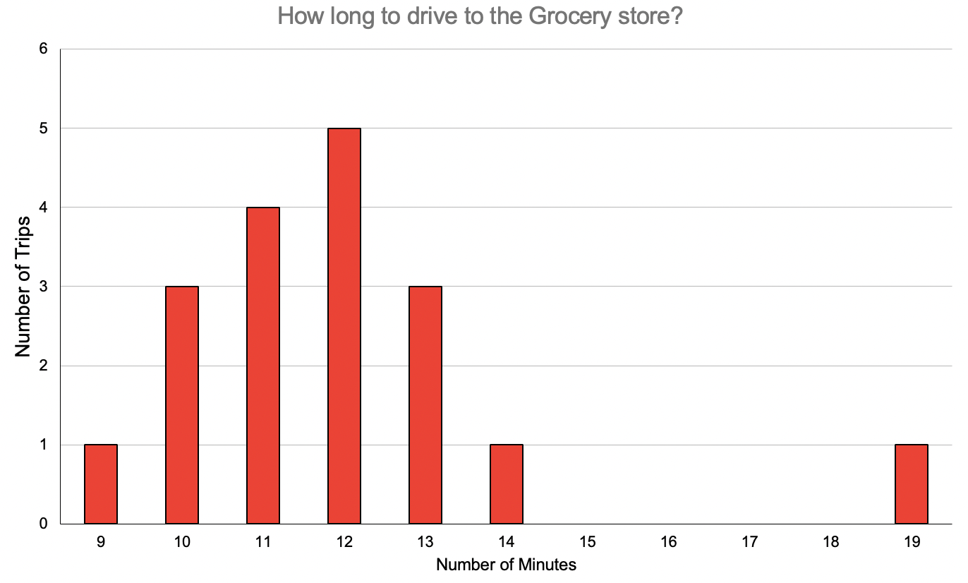
As you can see, while it takes an average of 12 minutes to get to the store, there is variation in the system’s outputs. There are factors in the system that cause variation in the time it takes to drive to the store.
In this case, it wouldn’t be statistically significant if it took me 10 minutes, nor would it be strange if it took 13 minutes. Those trips would be “normal” for a system with variations. Maybe I hit all the green lights? Or maybe I was stuck behind a slow driver?
However, there was that one trip that took 19 minutes. Was that the result of normal variation in the system, or did something unique happen there?
By understanding the variation in the system, we can do two things:
- Benchmark system performance and analyze individual data points.
- Implement process changes to improve results and address variation.
Taken together, this helps demystify our performance and sets us up for success in executing our strategy.
Measuring Variation
Variation is typically measured in the disbursement of a set of data points. You’ve seen this before in reviewing a “normal” distribution, as seen in a bell curve like the example below.

Many parts of our lives follow this pattern, including the height of people or IQ scores. But it can also be applied to system outputs, like my grocery store drive example above. Or, more relevant to our business strategy, systems like sales performance or lead generation.
The distribution of data points tells us to what extent variation can be expected in a system. The further a data point is away from the average, the less statistically likely it was caused by “normal” factors. It becomes more likely that something special happened that caused it. On the other hand, if a data point exists within two standard deviations of the average, normal variation was likely at play.
One way to review this data is with Control Charts, also known as Shewhart or statistical process control charts. These plot data points in a way that makes it easy to visualize whether or not your system is in “control” or if there are anomalies with any data points.
Here is the control chart for my grocery store trips:

You can see each trip plotted on the graph. The red lines are the control limits. These are approximately 2.5 standard deviations away from the average. Meaning, that it’s statistically unlikely that any data point from this same system would fall out of this range.
From the chart, we can draw a couple of conclusions:
- My grocery store trips from about 8 to 15 minutes are normal. I wouldn’t have to do anything differently to arrive in 9 minutes instead of 14 minutes. This type of variation is expected based on system factors (traffic lights, traffic around me, etc).
- The 19-minute trip was statistically significant. This trip is likely a special cause and should be analyzed to see what happened. In this driving example, maybe I encountered an accident that blocked an intersection. Or I had to change my route to fill up my gas tank quickly.
By measuring and understanding your system’s variation, you can identify what is normal and what results from a special cause. We call these common and special cause variations:
- Common cause variation results from natural or expected variation in the process.
- Special cause variation results from unexpected variations or factors in the process.
Once the thresholds of your system’s variation are established, you can analyze your data to determine if outputs are common or special causes.
Variation in Your Sales and Marketing Results
So, let’s return to your sales results. It’s been a bad month; you’re nervous. You know your manager will be “having a talk” with you about your results.
But was it really a bad month? Or were your sales in line with natural variability in your sales system?
Variation of Leads Generated
Below is an example Control Chart of qualified leads generated by a sales rep by month.
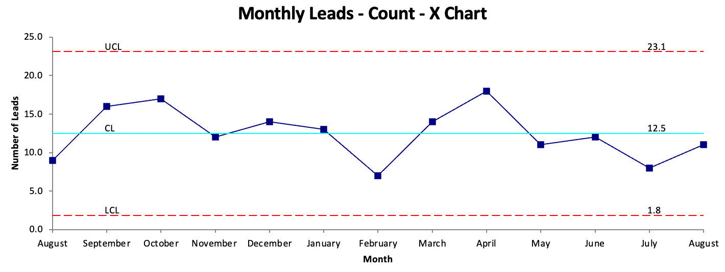
On average, this person generated 12.5 qualified leads a month. However, their system variation had an upper limit of 23 leads per month and a lower limit of 1.8 leads per month.
What does this mean? Based on their current sales process, anywhere between 2 and 23 leads per month are to be expected.
Getting 7 leads in February could result from the same activity, processes, and methods that generated 18 leads in April!
While this variation might seem like the result of effort, it’s truly a result of the system that is generating the leads. The same sales rep, doing the same activities, can produce dramatically different results.
These common cause variation points are not worth investigating. They don’t provide any unique insights into your strategy, and if anything, overcorrecting to them can do more harm than good (see if you can convince your boss of that).
Variation of Post Impressions
Now let’s look at an example that is directly related to social selling - post impressions.
We all know that the number of views and engagement you receive from each social media post can vary - but by how much?
Oftentimes, the answer is a lot.
Let’s look at a control chart of 90 days of LinkedIn post impressions:
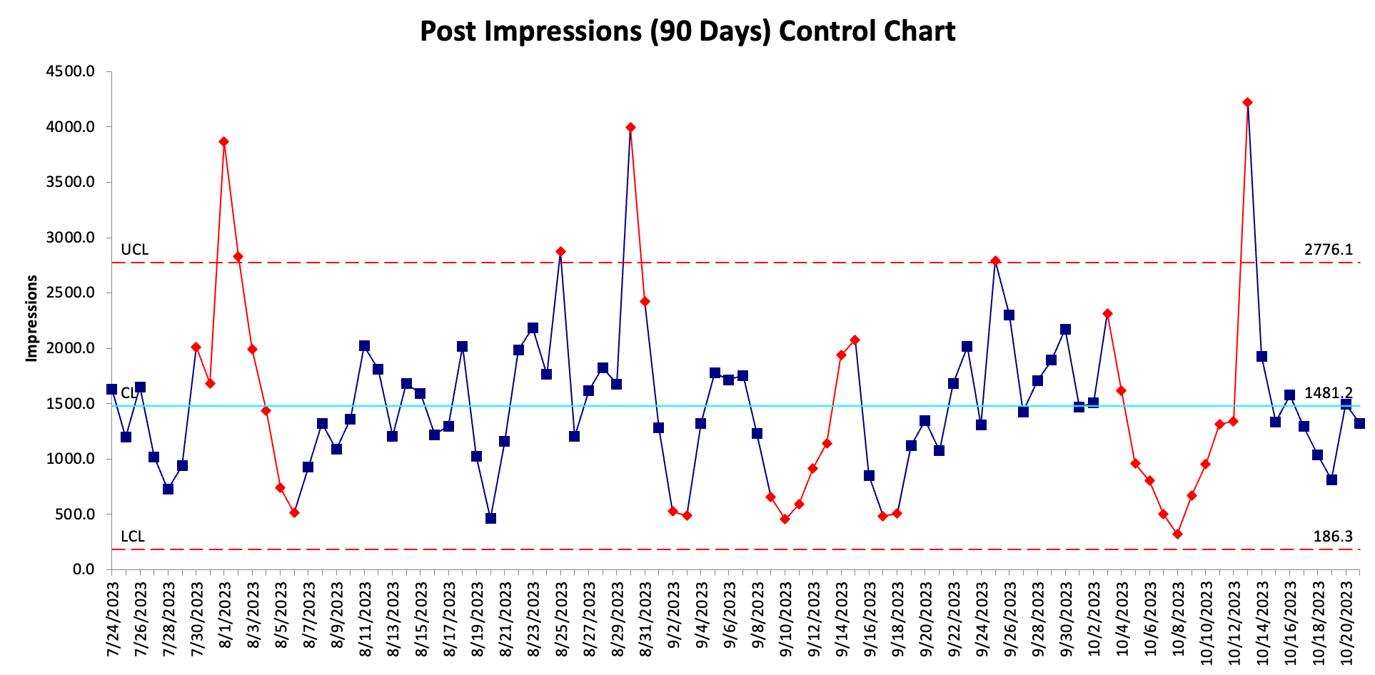
Based on the data for this person, their average daily impressions are 1,481 views, with an upper limit of 2,776 views, and a lower limit of 186 views. Meaning, that anywhere between 186 and 2,776 daily post impressions is normal given their current social content strategy.
And while it may feel better to get 2,000 impressions on a post than it does to get 300 views, either of these can result from the same exact process.
Looking at this example post impression data, you’ll also see that there are three days with post impressions outside of normal variability. Those days were: 8/1, 8/31, and 10/13.
Being that those are special cause variation, it’s worth investigating what made those days unique. Did you post something different? Did you do extra promotion of the content? Did you collaborate with influencers?
Data points that are outside of normal variation are worth investigating as they could indicate opportunities for growth, activities outside of your normal process, or problems that need to be addressed (if negative).
For instance, in this example data, this person had 3,865 impressions on 8/01. Outside of normal variation, this person had published a product announcement video on that day. It was a major announcement that resulted in extra engagement to their posts far beyond their normal content strategy.
While you can’t announce a new product every day… they can use this information to understand what causes special variation outside of their normal strategy results.
This same strategy can be applied to any special cause variation, whether it is monthly sales data, leads generated, or engagement on your social media posts.
Addressing Variation in Your Strategy
Armed with this knowledge of variation, let’s talk about how you can use it to improve your sales and marketing process.
Here are 5 tips to get started:
#1 Capture Good Data
Understanding your system results and variation begins with good data. Your entire sales and marketing team needs to be accurately tracking data. Ensure that your sales CRM and marketing software is set up correctly and collecting the accurate information. You’ll also need to work with your team to create standard definitions for tracked values.
#2 Calculate Your System Variation
Once you have a data set of outputs (sales numbers, leads, post impressions, etc.), you can run your variation analysis. You’ll want to find your process averages and the statistical distribution of the data (i.e., the standard deviations). Creating graphs in Excel and using built-in statistics tools are great starting points. You can use software packages like QIMacros and Minitab for more advanced analysis.
#3 Don’t React to Common Cause Variation
It’s time to STOP having pizza parties for good months and tough conversations for bad months if the data results from common cause variation. Reacting to single data points that are range bound of the control limits is not only unnecessary, but it can also be harmful if you over-react.
#4 Separate Signal vs. Noise
Separate the signal from the noise. Where are the outliers? What are the special cause variation events? Digging deeper into these data points can help you better understand unique circumstances that affected your system. These insights will allow you to improve your strategy.
#5 Change the system
And finally, if you are unhappy with the distribution of your data points, there is only one thing you can do – change the system. If you want to increase your average or reduce variation, you need to find the factors impacting your results and improve upon them. This might mean increasing training, adjusting ad spend, changing sales methodology, or more. You can’t force the results to change without improving the system that creates them.

For this week’s action items, I want you to review the variation in your strategy.
Take a deep dive into your data to understand what is normal, what is abnormal, and begin to leverage these insights to improve your results.
Here are three steps you can take:
- Collect and Analyze Data - Export your data sets from your software (CRM, social analytics, etc.). Then run an analysis to understand what the average of the data set is, as well as the dispersion. This will help you understand what values are normal, and what are special cause.
- Separate Signal vs. Noise - Next you want to separate the signal from the noise. Understand which data points are telling you something unique happened, and what are normal results from your system. And most importantly, STOP overreacting to common variation!
- Improve Your Strategy - Finally, brainstorm ways that you can improve your system. If you want to truly get better results, you need change the inputs and/or processes impacting your results. This could mean receiving training, implementing a new strategy, or experimenting with new types of content.